
When you create user interfaces in Flutter, it is important to prioritize UI accessibility to make applications usable for everyone. Design accessibility is not just a requirement; it is a way to open your product to a wider audience and make it functional for all.
Did you know that approximately 1.3 billion people live with some form of permanent disability? That’s one in six of us. These include conditions like loss of vision, hearing, or mobility. Beyond permanent disabilities, temporary conditions such as recovering from surgery or a broken limb can also impact how users interact with your application.
Addressing UI accessibility allows technology teams to create inclusive and usable products for everyone and, in this way, avoid barriers that exclude individuals with disabilities.
In this guide, Pavlo Zin, Flutter Department Lead at Uptech, and Mykola Melnyk, Design Lead, share actionable tips and techniques to address UI accessibility when creating Flutter applications. With years of experience working with clients across various countries and industries, Uptech has developed deep expertise in building and designing accessible digital products. So, we'd like to share our strategies to help developers and designers craft applications that meet the needs of every user.
What is UI accessibility, and why does it matter?
UI accessibility is about creating products that anyone can use comfortably, regardless of their circumstances or challenges. In other words, specialists must design interfaces that remove barriers and provide equal access for each and every user.
Why UI accessibility is important
Design accessibility considers diverse needs, including but not limited to individuals with
- vision or hearing impairments,
- cognitive or motor challenges,
- temporary injuries, etc.
It must also consider users under challenging environments, such as bright sunlight or noisy spaces.
The core idea of this approach is to make sure that interfaces remain intuitive, simple, and functional for every user.
There are guidelines that help make software design more accessible. They are called the Web Content Accessibility Guidelines (WCAG) 2.1. These guidelines define four essential principles for accessibility:
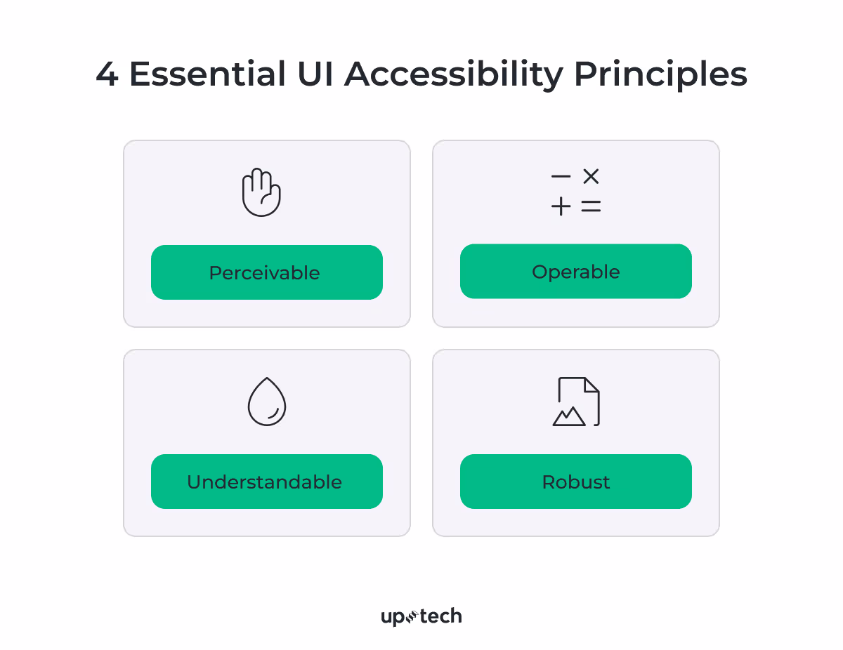
- Perceivable – information and interface elements must be visible or otherwise perceptible to all users.
- Operable – users must be able to interact with interface components, regardless of their abilities.
- Understandable – the interface must communicate information clearly, allowing users to navigate and interact without confusion.
- Robust – the content must be compatible with assistive technologies, ensuring usability across various platforms and devices.
UI accessibility bridges the gap between design and technology as it addresses both visual and functional aspects to create inclusive digital experiences. Let’s take a look at both sides.
The technical side of UI accessibility
On the technical side, developers must integrate tools and code that enable users with disabilities to access content effectively. This includes features like screen reader support, keyboard navigation, and adaptable layouts.
Screen reader compatibility. Developers must write code that communicates effectively with assistive technologies such as screen readers. For this, semantic HTML or ARIA (Accessible Rich Internet Applications) attributes are used to label buttons, images, and form fields clearly.
Keyboard navigation. Some users rely on keyboards or alternative input devices to navigate applications. Developers need to provide logical tab orders and focus states for interactive elements to facilitate smooth navigation.
Adaptable layouts. Applications must adapt to different screen sizes, orientations, and resolutions to accommodate users with visual or motor impairments. Implementing responsive design and scalable fonts allows users to adjust the interface to their needs.
The design side of UI accessibility
Design plays a critical role in accessibility, focusing on visual clarity, usability, and adaptability. Designers must ensure that interfaces are intuitive and cater to a wide range of users.
Color contrast and visual hierarchy. Clear color contrast between text and backgrounds helps with readability, especially for users with low vision or color blindness. Designers can use tools to check contrast ratios and ensure they meet WCAG standards.
Accessible typography. Font sizes, styles, and spacing must accommodate users with visual impairments or dyslexia. Avoid decorative fonts, and maintain line spacing that improves readability.
Consistent navigation. Predictable and consistent navigation structures help users, including those with cognitive disabilities, locate information and complete tasks more easily. Designers should use familiar patterns and avoid cluttered layouts.
Accessible forms. Form fields must include clear labels, instructions, and error messages to guide users effectively. Placeholder text alone should not serve as a label, as it can be difficult to interpret.
The above sounds great, but how to design for accessibility? Below, we’re sharing the core tips and tricks that may come in handy when you create your own Flutter app.
How to Achieve UI Accessibility? 10 Expert Techniques
As a leading cross-platform framework, Flutter offers quite a few tools and widgets to make it easier for you to design inclusive and adaptive UIs. Armed with these capabilities, you can deliver an exceptional user experience that reaches a broader audience, improves engagement, and demonstrates your commitment to inclusivity.
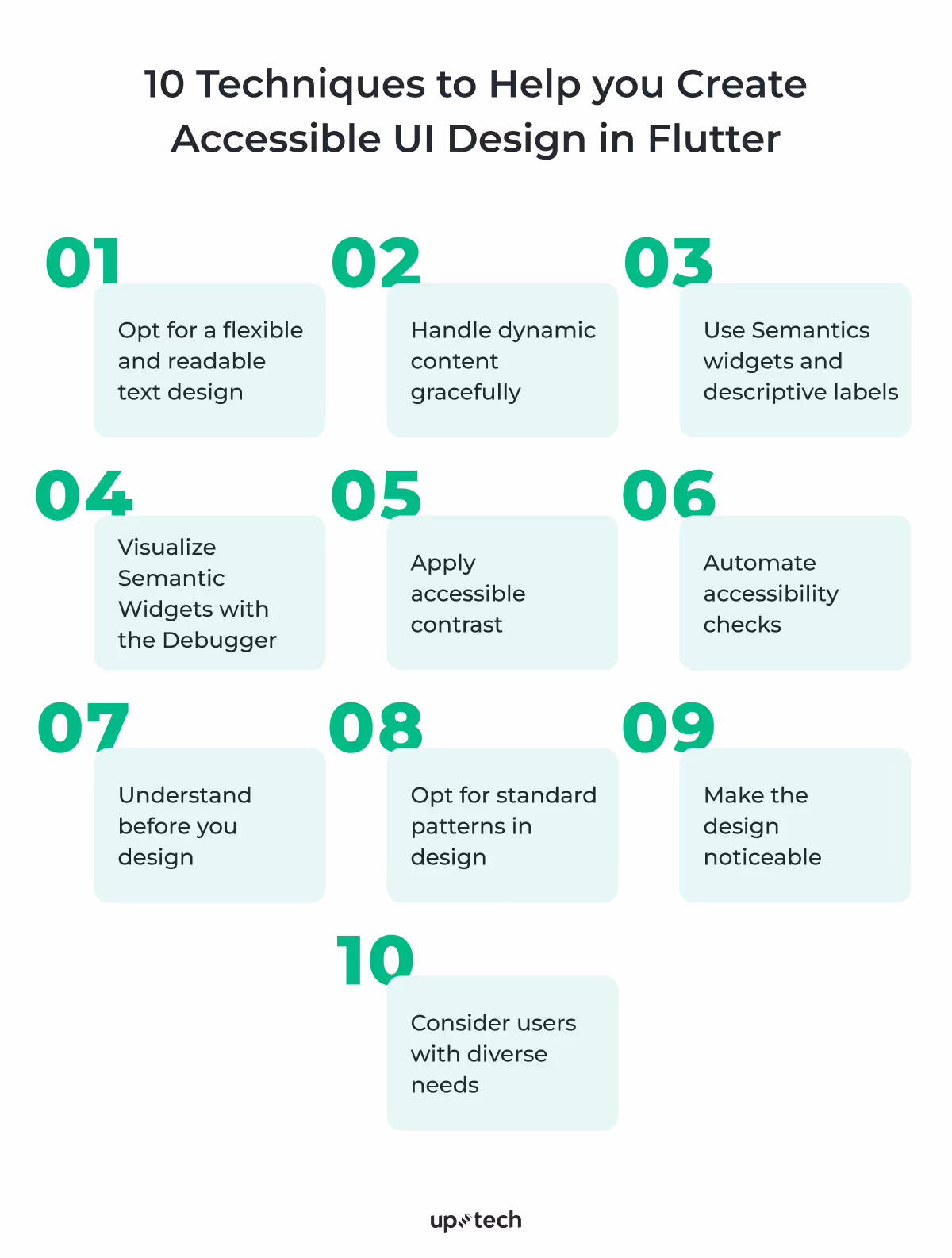
In this section, we will outline 10 essential tips and techniques to help you create accessible and responsive UIs in Flutter.
- Opt for a flexible and readable text design
- Handle dynamic content gracefully
- Use Semantics widgets and descriptive labels
- Visualize Semantic Widgets with the Debugger
- Apply accessible contrast
- Automate accessibility checks
- Understand before you design
- Opt for standard patterns in design
- Make the design noticeable
- Consider users with diverse needs
1. Opt for a flexible and readable text design
When it comes to accessible UI designs, the first and foremost thing to do is to ensure that text remains legible and adapts gracefully to its container. This is even of greater importance when users enable larger system font sizes or text scaling for better readability.
Hardcoding widget dimensions can result in truncated text, broken layouts, or inaccessible content. To create robust and user-friendly interfaces in Flutter, focus on flexibility and responsiveness in your text-based widgets.
Here are a few ways how you can effectively manage and display text to improve both usability and accessibility.
Ensure adaptive sizing for text-based widgets
Fixed heights for buttons or other text-based widgets can lead to issues when the text inside these widgets needs to adapt to varying font sizes, which may be influenced by user preferences or system settings for accessibility.
Hardcoded heights can cause text clipping, truncation, or misalignment, which results in a poor user experience, especially for users who rely on larger fonts for readability.
As a solution, try to avoid setting a fixed height for buttons or other text-based widgets. Instead, opt for adaptive font sizing – the approach thanks to which the text inside the widgets scales appropriately across devices with different screen sizes.
Apply thoughtful strategies for managing text-overflow
When handling text overflow in your accessibility UI design, it’s important to apply strategies that balance design consistency and content clarity. You can manage long text within confined spaces with properties like TextOverflow.ellipsis and maxLines. However, they should be employed thoughtfully so that critical information isn’t cut off.
For example, you can use ellipsis for non-essential text like subtitles or descriptions. At the same time, leave important content, such as error messages or primary labels, fully visible.
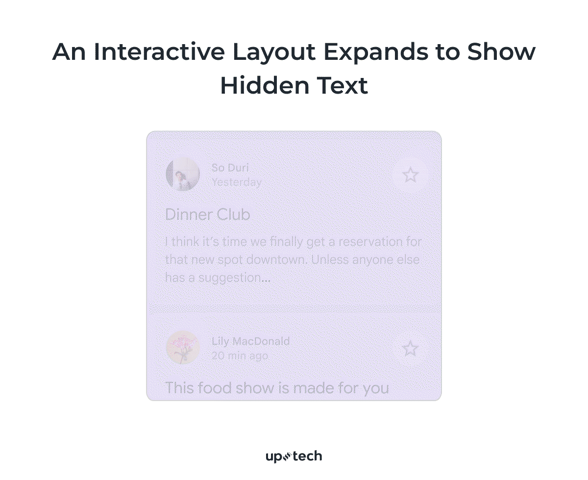
In scenarios where text may be too lengthy to fit within available space, you can provide users with tools to access the full content. Widgets like ExpansionTile, collapsible sections, or “Read More” links can be effective solutions to keep the layout clean while ensuring all information remains accessible.
Always test these implementations with dynamic text inputs to maintain both usability and accessibility across diverse user needs.
2. Handle dynamic content gracefully
Dynamic content — whether it’s user-generated or influenced by system-wide settings like large fonts — presents unique challenges for accessible UI designs. To ensure your app's accessibility and functionality, your layouts must adapt flawlessly to changing content sizes and structures. Flutter provides powerful tools to help you handle both scenarios effectively.
Adapt to large system font settings
Large system font settings can significantly affect your app’s layout, especially if text scales beyond its intended space. As users increase font sizes for better readability, layouts may break, text may clip, or elements may overlap if your UI isn’t designed to handle scaling gracefully. To ensure your app remains usable and accessible, it’s essential to plan for these scenarios and thoroughly test your layouts.

Testing your app with the system font size set to its maximum is crucial. Use the device settings or simulate large text scaling by overriding the MediaQuery.textScaleFactor during development to identify issues early. When designing your layouts, rely on widgets like Flexible and Expanded, which allow text to adapt to available space without causing overflow or clipping. Additionally, for complex layouts with multiple elements, consider using Wrap to handle content that needs to flow into multiple lines or OverflowBar to dynamically manage alignment and spacing. These techniques will be explored in greater detail in the next section.
Design layouts for dynamic content
Dynamic content, such as user-generated data or long text strings, requires careful layout planning to maintain usability. Whether it’s a long name, a detailed description, or user comments, your accessibility UI design should adapt without breaking or looking cluttered.
Use Wrap for overflowing content. The Wrap widget dynamically arranges its children across multiple lines if there isn’t enough horizontal space, preventing clipping or truncation.
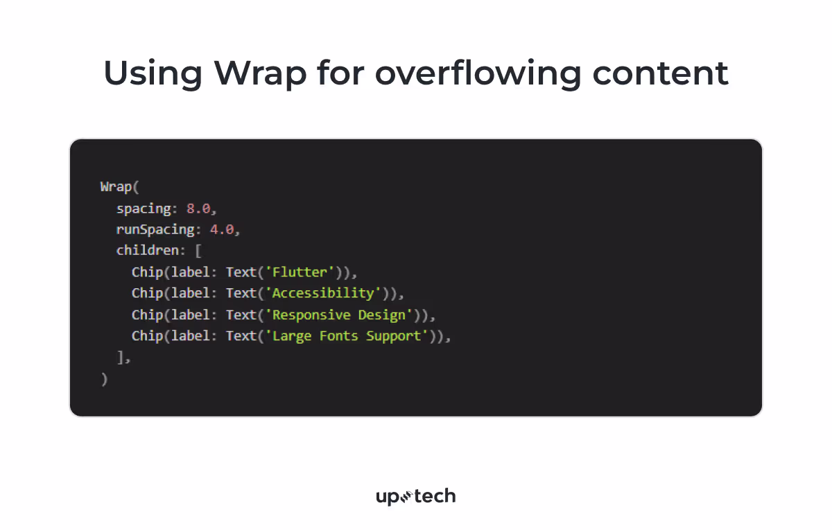
In this example, the chips automatically wrap to the next line when space is limited, ensuring all content remains visible.
Leverage OverflowBar for flexible alignment. OverflowBar is ideal for layouts with a mix of dynamic content and actions. It adjusts its children’s placement based on the available space, keeping the design clean and accessible.

This approach prevents content from overlapping or being cut off, even with larger font sizes.
Use scrollable widgets for overflowing content. For exceptionally long or unbounded content, such as detailed user comments, long lists, or extended descriptions, wrapping the content in scrollable widgets is a practical solution. Flutter provides several widgets like SingleChildScrollView and ListView to handle scrolling efficiently and maintain usability.
However, it’s not always immediately clear that content needs to be scrollable. Specific scenarios, such as user-generated content that unexpectedly grows in length, smaller device screens, foldable devices with unconventional aspect ratios, or large system font sizes enabled, can lead to situations where content exceeds the visible area. Proactively planning for these cases ensures your layout remains functional.

Control text scaling for design consistency. Thee are certain scenarios where this automatic scaling might lead to unintended design issues. In such cases, you can use MediaQuery.withNoTextScaling to temporarily disable text scaling for specific parts of your UI.
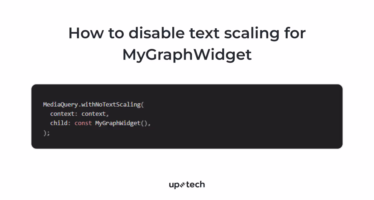
For example, in graphs, charts, or visualizations, text like axis labels or legends might become misaligned or unreadable if scaled too much. Disabling text scaling ensures the elements stay proportionate and the visualization remains clear.
3. Use Semantics widgets and descriptive labels
Creating accessible UIs in Flutter starts with providing clear context and meaning to every element on the screen. By leveraging Flutter’s Semantics widgets and adding descriptive labels, you ensure that assistive technologies, such as screen readers, can interpret your app correctly for users with visual impairments.
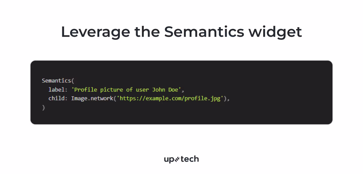
Leverage the Semantics widget
Wrap widgets in a Semantics widget to give them additional context or to override their default accessibility properties.
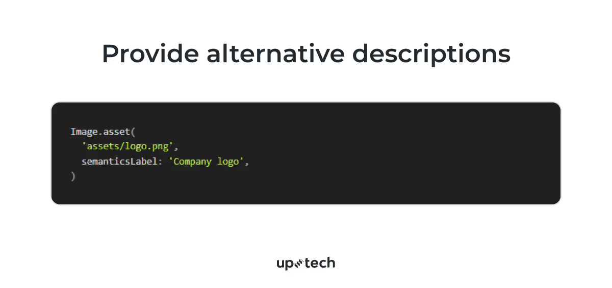
Provide alternative descriptions
Use the semanticsLabel property for widgets like Image to describe visuals in a way that makes sense for non-visual users. For example:
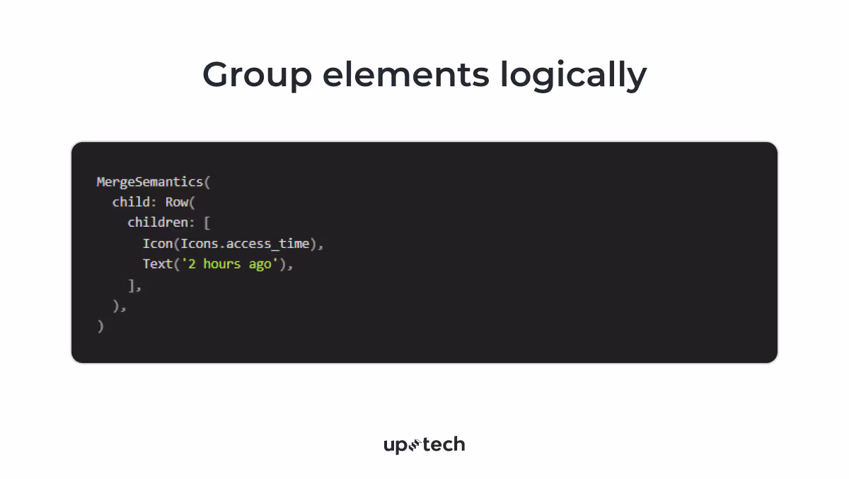
Group elements logically
Use MergeSemantics to group related widgets into a single logical entity for screen readers. This makes navigation simpler for users.
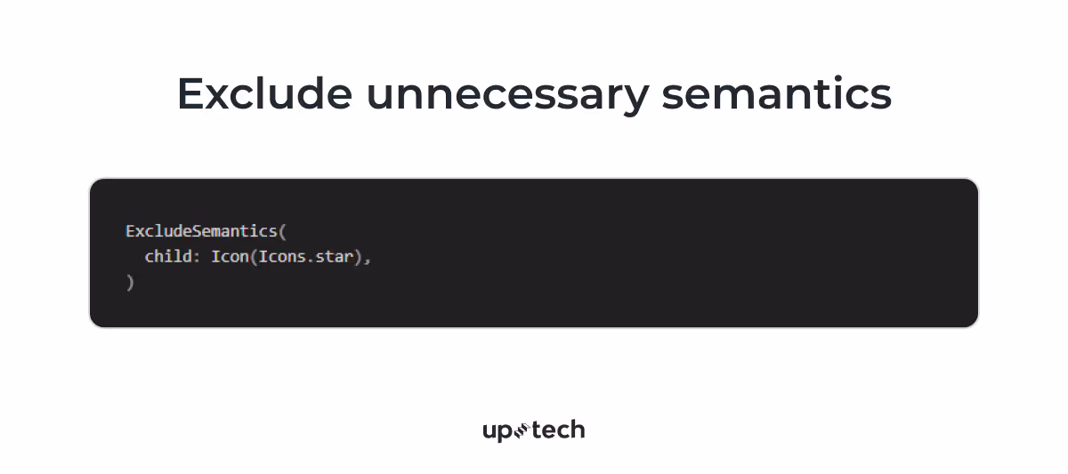
Exclude unnecessary semantics
For decorative elements or purely visual content, use ExcludeSemantics to prevent them from being announced, keeping the screen reader experience clean and focused.
4. Visualize Semantic Widgets with the Debugger
To visually inspect how your semantic widgets are working, enable the showSemanticsDebugger property in your MaterialApp. This overlays a visual representation of the semantic tree on your app.

As a result, each section, from navigation buttons to key information fields, is color-coded, showcasing how semantic elements structure the UI. This practice aligns with AI accessibility principles as it makes interfaces more organized, user-friendly, and compatible with assistive technologies.
Test with screen readers
Use tools like TalkBack (Android) or VoiceOver (iOS) to navigate your app as a visually impaired user would. Ensure:
- Interactive elements have meaningful labels (semanticsLabel).
- Focus order is logical and intuitive.
- Custom widgets include proper semantic roles.
- Actions and errors are announced clearly.
Test on real devices to verify gestures and hardware-specific behaviors.
5. Apply accessible contrast
Color contrast is a critical element in designing accessible and responsive UIs, especially for users with visual impairments such as color blindness or low vision.
Adequate contrast between foreground (like text) and background colors is essential to ensure that all users, including those with vision impairments, can read and interact with the app content.
The Web Content Accessibility Guidelines (WCAG) provide specific contrast ratio requirements:
- A minimum contrast ratio of 4.5:1 for normal text
- A contrast ratio of 3:1 for large text (text that is 18pt and bold or 24pt and above)

- Use a color palette that provides sufficient contrast. You can leverage tools like WCAG Contrast Checker to validate the color contrast ratios in your app design. This helps ensure your colors meet the recommended accessibility standards.
- Use MediaQuery.highContrastOf to detect user preferences, such as device settings for high contrast or dark mode. You can then dynamically adapt colors in response to user preferences, providing an optimal experience for users with accessibility needs.
- If you’re designing with Figma, consider using a contrast checker plugin to evaluate and optimize accessibility during the design stage.
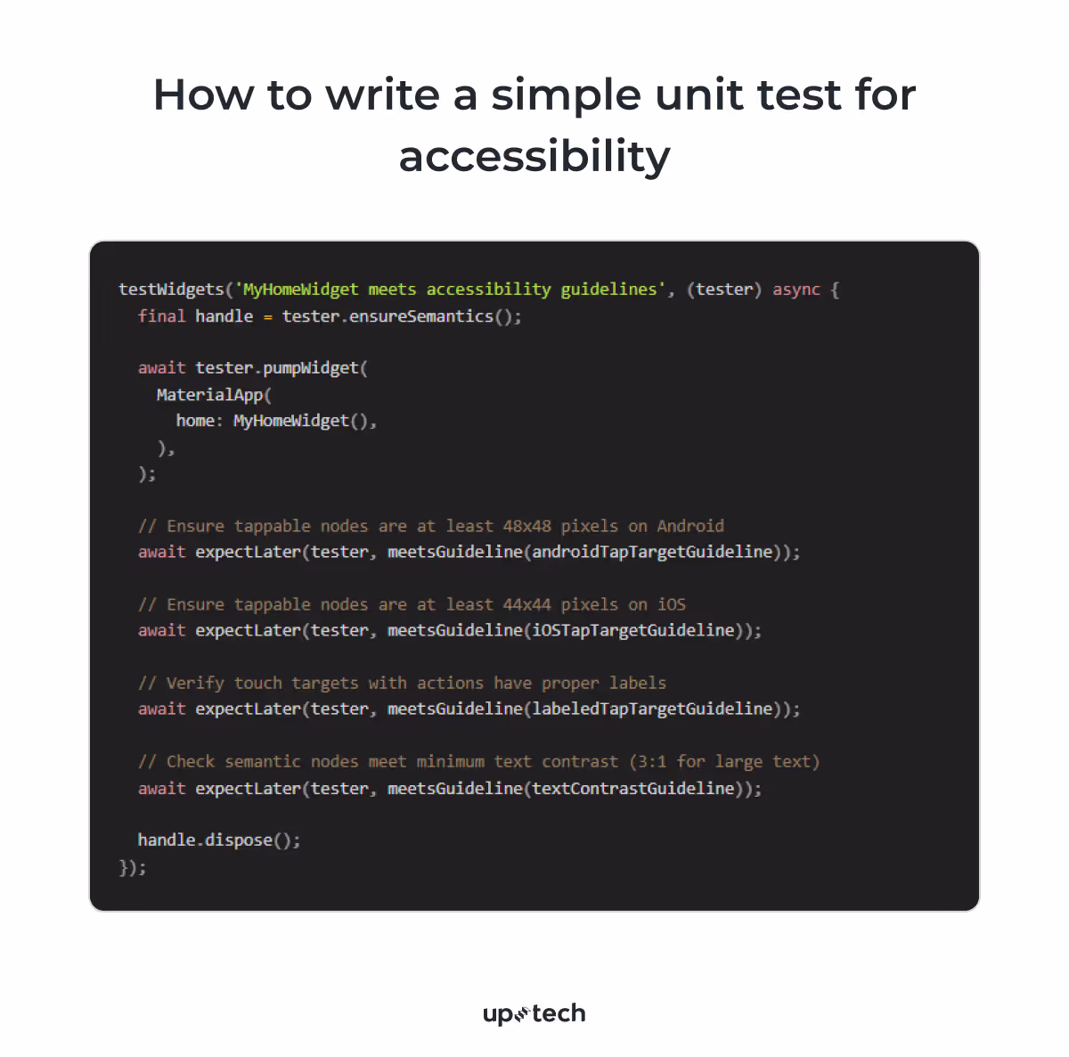
6. Automate accessibility checks
Flutter provides AccessibilityGuideline in the flutter_test package to help automate the validation of accessibility features during unit testing. This ensures that your app meets accessibility standards without relying solely on manual testing.
7. Understand before you design
The effective, accessible design begins with understanding the diverse needs and experiences of users rather than jumping straight to solutions. Take the time to explore these needs through formal studies, user feedback, and informal observations. This approach not only reduces biases but also sparks innovative ideas for creating experiences that are inclusive — even for those outside conventional design norms.
By anticipating a wide range of user interactions and challenges early in the product design process, you can minimize barriers before they arise. And when unexpected issues do occur, they provide valuable opportunities to learn, iterate, and adapt your design, fostering a culture of continuous improvement and accessibility.
8. Opt for standard patterns in design
The key question here to ask yourself is: “How understandable is a design element for users?”
According to Jakob’s Law, "Users spend most of their time on other sites." This means users approach your product with expectations shaped by other platforms.
Design patterns must be intuitive and predictable to make interfaces accessible. Use standard and familiar design solutions for common elements like buttons, links, and checkboxes.
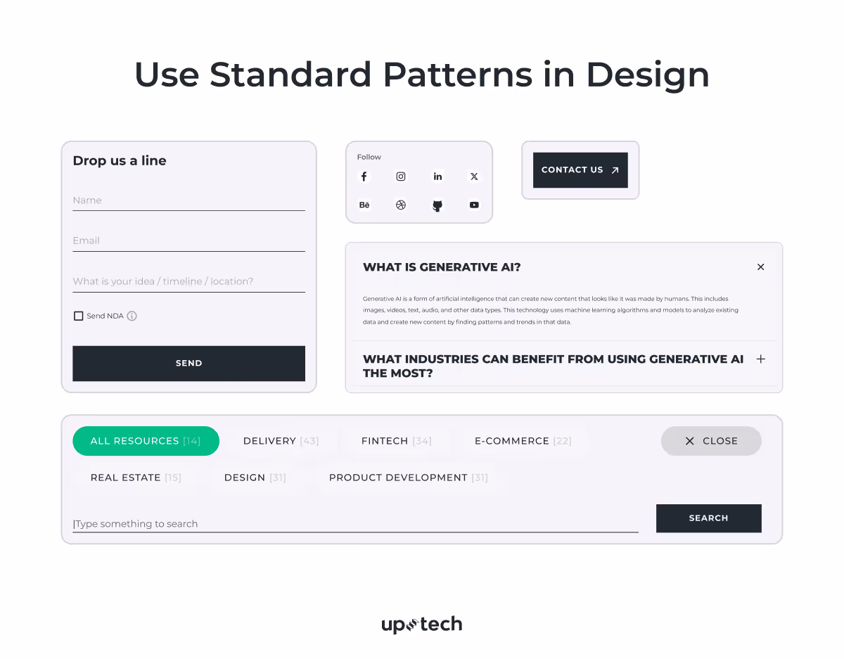
For example, buttons should look clickable, and links should be blue and underlined, as users naturally associate these patterns with specific actions. There’s no need to reinvent the wheel by creating overly unique styles, such as a checkbox that looks like a button, as this can confuse users and create unnecessary friction.
When you design in line with familiar patterns, your product meets these expectations, reducing frustration and making interactions more seamless.
On top of this, interactive elements should have the same appearance and behavior across all screens and sections of the interface. This reduces the learning curve for users and helps them navigate the product efficiently without confusion.

9. Make the design noticeable
Here, it’s important to focus on 3 UI accessibility aspects:
- Visibility
- Visual noise minimization
- Accessible sizes and placement of design elements
Visibility. Users must be able to locate and interact with critical elements without difficulty. While contrast is crucial, it should not be the sole method for conveying information. For example, when showing error states, use a combination of colors (like red), text labels, and icons to communicate the issue. This approach supports users who may have color blindness or other visual impairments.
Minimize visual noise. An interface cluttered with unnecessary elements can overwhelm users and make it harder to focus on key actions. Prioritize simplicity in your accessible UX designs by reducing distractions and highlighting essential elements. Related components must be placed near each other as they are perceived as part of the same group, according to the Law of Proximity.
This helps users understand the relationships between different elements and navigate the interface more effectively.
Accessible sizes and placement. The size and spacing of interactive elements significantly impact usability.
Buttons and other clickable components should be at least 44x44 pixels to accommodate users with motor impairments or those using small mobile screens. Ensure there is enough spacing between elements to prevent accidental taps or clicks.
As for the placements, position critical elements in accessible areas based on natural hand movements, especially for mobile devices.
For example, frequently used buttons should be placed within easy reach of the thumb. Following Fitts’s Law, which states that larger and closer elements are easier to interact with, ensures users can efficiently perform actions without unnecessary effort.
10. Consider users with diverse needs
Last but not least, you must always design to accommodate users with different challenges.
For users with partial or complete vision loss, alternative methods of interaction are essential.
- Add descriptive alt text for images and graphical elements to allow screen readers to interpret them accurately.
- Enable text scaling up to 200% without breaking the layout or reducing functionality. This helps users who rely on larger text sizes for readability.
Motor impairments can limit precision and speed; that’s why the design must be thoughtful design.
- Ensure the interface supports full keyboard navigation, covering all functionalities, including forms, menus, and buttons.
- Avoid gestures that require precision, such as double taps or swipes. Instead, provide simpler alternatives like single taps or clear keyboard shortcuts.
Simplified and clear content benefits users with cognitive impairments or limited attention spans.
- Use plain language and straightforward instructions to avoid confusion. Break information into smaller, digestible sections.
- Add visual aids, such as icons, next to text to reinforce understanding and improve comprehension.
Align your design with recognized accessibility standards like WCAG (Web Content Accessibility Guidelines) and ADA (Americans with Disabilities Act). These frameworks provide comprehensive guidance for creating inclusive interfaces that serve all users effectively.
We have outlined 10 essential UI accessibility tips, covering both the technical aspects of Flutter development and the design principles needed to create inclusive interfaces. But what about real-life cases? Well, we have one.

How Uptech Achieves UI Accessibility: Practical Case
At Uptech, accessibility is a priority from the start of every project. In a recent healthcare app designed for people with eye-related issues, we integrated accessibility best practices from the beginning, including those described in this guide. When designing UX for a healthcare app, we ensured support for large system font sizes, dynamic layouts, proper semantics, and responsive designs to create an inclusive experience for all users.
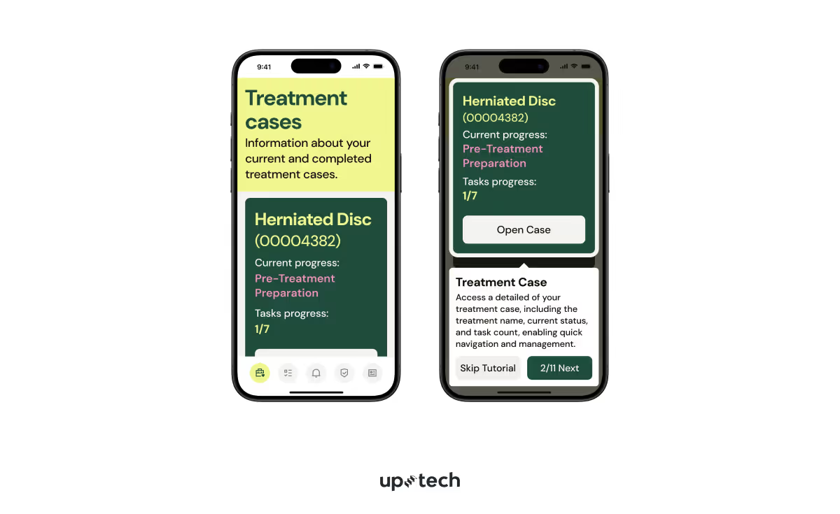
Challenge. One specific challenge arose with the app’s tutorial overlay view, where we provided helpful tips to guide users through the interface. The overlay UI displayed a translucent layer over the main screen, with text explaining how to interact with various features.
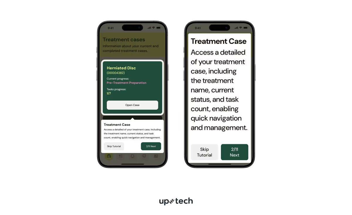
When users enabled large system font sizes, the tutorial text often exceeded the available space. As a result, it was unreadable. Due to the fixed nature of the overlay design and its interactive elements, we couldn’t just add a scroll view.
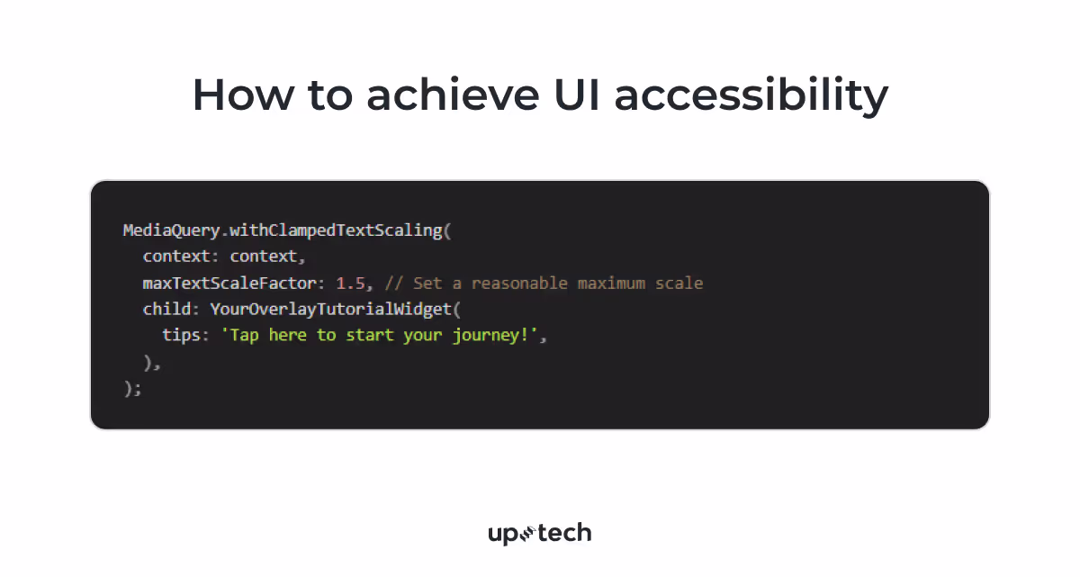
Solution. To address this, we used the technique that we described earlier in the text – MediaQuery.withClampedTextScaling – to limit the maximum text scale for the tutorial overlay, as well as some parts of the main UI. This approach allowed us to retain a consistent and readable layout without breaking the design while still respecting user accessibility preferences.
This ensured the tutorial text was adapted to user settings without overflowing, preserving usability and accessibility.
By thoughtfully managing text scaling in this specific use case, we maintained a balance between accessibility and design integrity. The healthcare app successfully provided an accessible and seamless user experience, even in scenarios where traditional solutions weren’t suitable.
Bonus Tip: Conduct Usability Testing for Better UI Accessibility
An accessible user interface is only part of the process. The real test lies in how users interact with your product in real-world scenarios. Usability testing helps bridge the gap between theory and practice because it uncovers those UI accessibility barriers that might not be apparent during development. For this, you need to perform two types of testing:
Moderated usability testing involves direct interaction with users in a controlled environment. A moderator observes and guides participants as they navigate the interface and asks questions to understand their thought processes and identify pain points.
Unmoderated usability testing, on the other hand, allows participants to test the product independently, without direct supervision. This approach is faster, cost-effective, and captures how users interact with the product in their natural environments. Tools like screen recorders or user feedback surveys can help collect data, providing valuable input to improve design accessibility.
By combining both methods, you can gather a comprehensive understanding of your product's accessibility performance.
Ready to make your app accessible to everyone? At Uptech, we create inclusive and user-friendly digital products. Reach out to our team to build an accessible Flutter app that meets the needs of all users and stands out in the market.
FAQs
What is UI accessibility?
UI accessibility is the design of user interfaces usable and inclusive for all individuals, including those with temporary or permanent challenges such as visual, auditory, or motor impairments. It ensures that digital products are functional for the broadest range of users possible.
What is accessibility in UX?
Accessible UX designs focus on the creation of user experiences that consider the diverse abilities, contexts, and needs of all users. This includes intuitive navigation, clear communication, and flexible interaction paths to accommodate various challenges.
Why is accessibility important in UX/UI?
Accessibility ensures that everyone, regardless of their abilities, can engage with and benefit from digital products. It improves usability, broadens your audience, and aligns your product with ethical standards and legal requirements like WCAG and ADA.
What are the best practices for UI accessibility?
In addition to the tips in the article, you can also:
- Provide keyboard shortcuts for common actions.
- Test with users of diverse abilities.
- Offer clear feedback for actions and errors.
- Support assistive technologies like screen readers.
- Avoid auto-playing media content.
How do I make my UI accessible?
Start by understanding your users' needs and following accessibility guidelines such as WCAG. Use features like keyboard-friendly navigation, scalable text, and descriptive alt texts for images. Regularly test your UI with assistive technologies and real users to identify and resolve barriers.
What is an example of an accessible UI?
An accessible UI might include a form with large, clickable input fields, clear labels, and error messages that combine text and icons. It would also support keyboard navigation, offer text scaling, and provide sufficient color contrast for readability.


.avif)