According to statistics, as of 2020, the number of healthcare apps has ballooned to 90,000. This is quite an impressive number, knowing that in 2008 the App Store counted no more than five hundred apps.
As the number of healthcare products are increasing fast, the competition in the domain is becoming more and more demanding. So how to stand out in the ever-growing row of the same-looking apps? Well, a team of experienced UX designers can help to make your healthcare app a hit.
In this article, I want to outline some principles of an effective UX design for healthcare apps, look at the main challenges of creating this UX design and give recommendations from my own experience.
Let’s start!
3 Main Challenges When Building UX Design for Healthcare Apps
Creating UX design for a healthcare app is complicated. Creating a UX design that responds to user needs is twice as hard. Yet, being aware means being armed, they say. So let’s look at the main hardships that you might stumble upon when designing a healthcare app’s UX.
Dealing With Two Target Audiences
Healthcare apps usually come as the intermediary between the patient and the doctors. As a result, this adds one more complicated element to the process – you have to deal with two target audiences. Well, it is not difficult, just a bit of work to do.
In this case, you need to consider the needs of both groups and build your UX healthcare design according to them.
Check out all-in-one guide to medical web app development
Digitization of Processes
It often happens that projects in healthcare are linked to the digitization process, which means bringing the offline routine online. This is where you must strike a balance between adapting to the current processes and generating new ones that will exist in the digitized version only.
Tackling Abundant Info On the Screen
Another challenge healthcare UX designers face is the abundance of information on the screen. From my experience as healthcare UX designer, there are several ways in which you can solve this problem:
- Taking care of information architecture;
- Usability testing of UX prototypes;
- Observe how the user percepts the information on the screen;
- Testing the UI.
Uptech Protip: sometimes, even these measures are not enough. So here are some UX designer’s life hacks to adapt to the large amount of information on the screen:
- Make scrollable tables instead of static ones;
- Make the screens based on cards instead of tables;
- Create a few screens instead of massive information.

9 Main Principles to Follow When Building UX Design in Healthcare
I will hardly surprise you if I tell you that UX healthcare design development is no different from developing UX for other types of apps. And consequently, the same general principles of UX development apply here. Here are some of them:
People Orientation and Functionality
Healthcare is a very sensitive domain, and it requires special attention to people’s feelings. So the key here is that the healthcare app’ UX design is user-oriented and helps to accomplish their purposes.
At the same time, the healthcare UX design should be functional, targeting the people’s needs to accomplish some goal.
Providing Control and Freedom
Sometimes users can make mistakes or change their minds when making decisions or interacting with applications. And of course, the app interface should enable the user to exit unwanted flows, undo wrong actions, or back to the previous state of the interface.
.png)
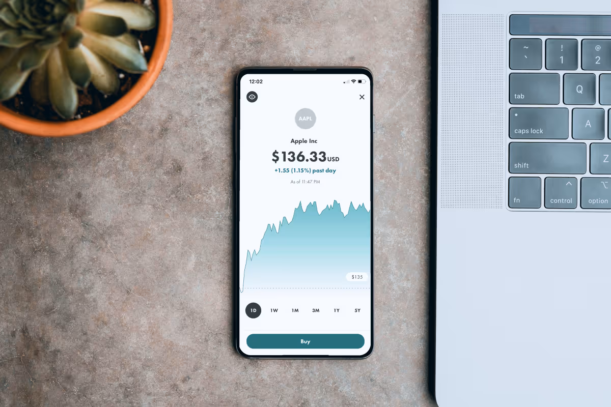
Clear and Intuitive Design
Your healthcare app should not be another hard knowledge milestone the user learns in their life. Instead, the user should feel that using your app is no more complicated than brushing teeth or drinking a glass of water.
The UX design of your healthcare app should be intuitive, which means simple and predictable.
Let’s look at an example of intuitive design. In this picture the UX design is intuitive ( as it clearly indicates that the user should enter their address in the field:

Consistency
There is a well-known saying among designers that you should assume that the majority of the time your users spend on other apps (even if this is not true). Therefore, when finally switching to your app, users should not face difficulties adapting to your UX design in the healthcare app. And to this end, consistency is the key.
All the elements of the healthcare UX design should be consistent. This means that a button in the apps should look like an actual button, and a headline should look like one. So putting it shortly – do not complicate things when there is no need for complication.
So how would UX design, which complicates users’ lives by its inconsistency, look? For example, it will have the layouts, the fonts and the colors look at the main page and other pages of the websites. This is totally confusing for the user and makes the UX design inconsistent.
Now let’s look at the example of consistent UX design:

In this design there is no room for “surprise”, so the users always know what to expect on the following pages.
Accessibility and Inclusivity
These two are very important when it comes to building healthcare UX design. The target audience of such apps can include people with disabilities or restricted abilities. And your purpose is that such users do not feel isolated using your app.
For example, you can use a voiceover functionality that will talk out the interface to help people with poor eyesight easily navigate the app.
Clear Content Hierarchy
You must provide clear and structured content to make it easy for users to navigate the app. Firstly, it makes it visually satisfying for the user to see well-organized text and pictures. Secondly, it helps the user to navigate more effectively.

The visual hierarchy is delivered here by the great combination of fonts and text sizes. The user’s eye is drawn to the headline first, and then wanders around the rest of the page.
Errors’ Prevention
One of the primary purposes of building UX for healthcare apps is to forecast all the possible missteps the user can stumble upon and prevent this from happening. In this sense, the UX designer's job is somewhat similar to a deminer – you gotta find the problem and not leave it a chance to happen!
To the end errors preventions, there are two instruments that you can use:
- Usability testing: once you have a UX prototype of your healthcare app, try testing it with potential users or, as they are sometimes called – "early adopters." From such tests, you can see how the user completes the flow and which problems arise during this process.
- Analytics: When the healthcare product has already been launched, you can track the users' analytics to see where they face difficulties accomplishing the tasks.
Speak User’s Language
One of the fundamental rules to follow when building the UX design for a healthcare app is using the language that the user speaks in daily life. Try not to complicate the words. When you can say it more straightforwardly, give hints and recommendations while still not being too persistent. In one word – be a polite human being.
Responsiveness
Responsiveness in UX design means that the design is adaptive to the devices and formats it is supposed to work in. For example, when shifting to a mobile version of the website, a responsive design will automatically rearrange its elements to perfectly fit in the physical characteristics of the new device.
An example of truly responsive design is Dribble. It has a flexible grid, which shifts from five columns on the laptop design to just two columns on the tablets and mobile phones.

Building a Healthcare App’s UX in 6 Steps
Well, enough preparations and forewords! Let’s get down to business. Here are the main 6 steps to build a great UX healthcare app’s design:

Step 1 – Gather Info
When starting your journey in the healthcare app development process, it is highly important to remove the first layer of uncertainty. Usually, you can do it by talking to stakeholders.
At the end of this stage, you will have some assumptions, which you will validate during the following stages.
Step 2 – Find your TA
Who are you building your healthcare app for? This is a key question that will define your healthcare app’s design. Once you know your users – talk to them. Learn your users’ desires and pains, and make assumptions about how you can help them overcome these hardships and improve their lives.
Step 3 – Talk to Domain Expert
The next step will be identifying how the problem you found is solved at the moment. Explore the whole healing process of your users, and talk to the domain experts to get some recommendations.
At this step, you need to complete a List of Hypotheses that need to be tested.
Step 4 – Outline the List of Features
As you have now explored the needs and desires of your target users, try to make a list of features that will help users to solve their problems.
At the end of this stage, you will have a list of features for your future healthcare app, which will follow in a specific prioritization.
Need extra hand of help in developing healthcare app?
Check out healthcare software development services we offer.
Step 5 – Make a Prototype
The next step in your journey will be to build a functioning prototype of your healthcare app and run it through User Tests.
According to the results of these tests, you can make changes to the prototype.
Step 6 – Create a UI Concept
The last step of your healthcare app development journey will be to build a UI concept and develop the app’s UI based on this concept.
Healthcare App UX Design: Uptech Experience
Our team has excellent experience building healthcare apps. For example, there was this mental health app, which was supposed to provide fast and affordable psychological help to clients via instant 5-min calls. We clearly realized that we were dealing with a sensitive topic of psychological help, so profound research into users’ pains and needs was a must.
So we started with a Discovery Phase.
Uptech’s Protip: Discovery is a crucial step in UX development. This is especially true for products that need to exude empathy towards the users. Only by speaking directly to your users can you understand their true pains, desires and needs.
This is where we conducted a bunch of user interviews and ran user tests to ensure we knew what the target audience needed.
Understanding real user needs helps us build a UX healthcare design that speaks directly to the user and adds a unique value proposition to the product.
Conclusion
A healthcare app’s design development follows the general principles of design development. Yet, certain challenges are specific for this niche in particular.
If you would like a more detailed description of the whole UX design development for your healthcare app, don't hesitate to get in touch with our Sales Manager, and they will help you with any of your requests.