Epigraph: If you just want to copy and paste code to your javascript project — click here, but if you want to understand how to do this, understand why other ways are not suitable for this task, then settle down comfortably and get ready.
Once upon a time I received the assignment … I needed to develop a website for our awesome Uptech Team. When I saw the designer’s missive I was surprised. There were plenty of files with extension *.ae (Adobe After Effects). This meant only one thing. The new site will contain a lot of d̶a̶m̶n̶ ̶m̶a̶g̶i̶c ✨ animations.
So, let’s begin the journey into the world of m̶y̶s̶t̶i̶c̶i̶s̶m̶ ̶a̶n̶d̶ ̶m̶a̶g̶i̶c̶ JS’s requestAnimationFrame() and CSS transitions 🍀.
The first thing I decided to do is to implement animation, which we called ‘amoeba animation’
This animation was designed using wiggle path After Effects feature, which made the task even more complicated. Let’s look at the ways of solving the problem.
1. Lotti (bodymovin) 🚫
The first thing that came to my mind is the use of a lottie (earlier known as bodymovin) plugin for Adobe After Effects. Lottie is a mobile library for Web and iOS that parses Adobe After Effects animations exported as json renders them natively on your web or mobile project! But, unfortunately lotti doesn’t support animation processing, which developed using wiggle path (see more).
2. Rendering to MP4/GIF file 🚫
The other way to implement this kind of animation is render AE animation to mp4/gif file, but, as I know, AE has problem with rendering wiggle path animation. Also, to make the animation seem more natural we need to write a file with a long duration which will lead to an increase of the file size, which is not desirable for the website, given that the animation object is on the home page.
3. Clipping and Masking 🚫
As MDN says:
Clipping refers to removing parts of elements defined by other parts. In this case, any half-transparent effects are not possible, it’s an all-or-nothing approach.
Masking, on the other hand, lets us make soft edges by taking transparency and grey values of the mask into account.
Nowadays you can perform these operations in two ways: using CSS or using SVG. But, the miracle didn’t come true. These technologies have drawbacks that have become key in our case:
❌ Poor browsers support (what?!). Yes, even if caniuse.com says that the browser SVG has basic support, you may encounter rendering artifacts. As for CSS, some browsers don’t support CSS-clipping/masking.
❌ Need to render GIF file. If you want to use masking you should have a file with animated shape as a mask. Disadvantages of using GIF-files were considered here.
❌ Poor performance (perhaps this applies only to my case). Yes, I managed to render this animation from Adobe After Effects to GIF-file (I recorded it from my screen, then converted MP4 to GIF 😅). The gif-animation was of poor quality, but it was enough for being used as a mask. But animation was rendered only with 8-12 FPS 😕 which was not enough for providing good user experience.
4. Create you own “Amoeba” using svg and D3.js. ✅
Why D3.js?
- I’ve worked with this library before😅;
- I represented “amoeba” animation as mathematical model and, as we know, D3.js is a JavaScript library for manipulating documents based on data.
Let’s remember the math
To hell with math, give me the code!
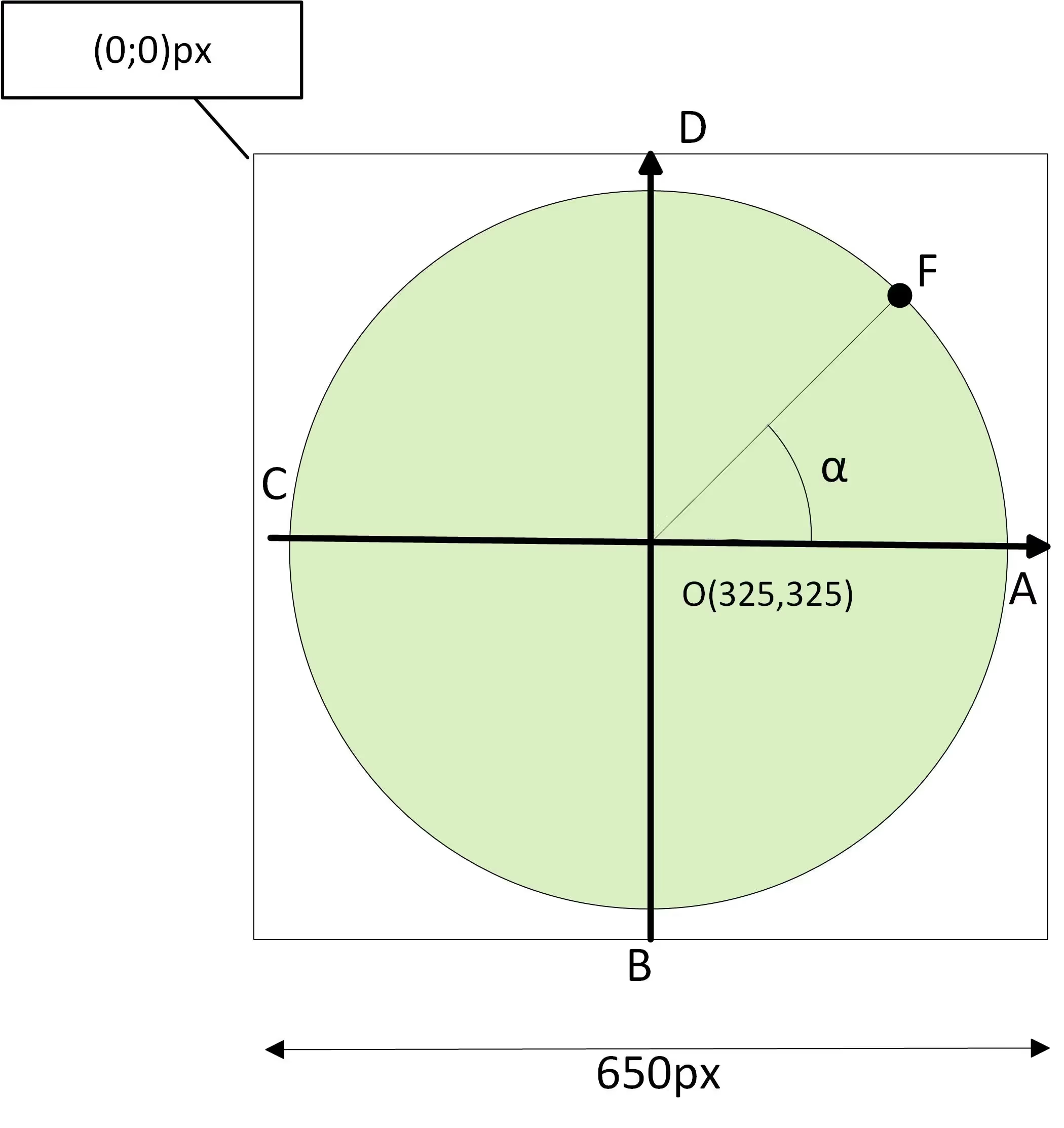
Let’s begin with the fact that we have a circle with a radius 300px (the designer drew it this way).

Geometry tells, that we should find the coordinates of a point on a circle this way:

Where Xo, Yo are the coordinates of the center of the circle, R - radius of the circle.
But, why do we need this information?
Because knowing this information we can create new dots by adding offset to old dots!
For X coordinates of dots of the right hemisphere the offset has a positive sign, for left hemisphere - negative sign.
For Y coordinates of dots of the top hemisphere the offset has positive sign, for right hemisphere - negative sign.
For example, for dot F we get the following expression:

Where F’ is a new dot, a is a horizontal offset, b — vertical offset.
Finally, proceed to the code 😉!
Let’s draw the circle using SVG path through D3.js (code explanations you can find at code comments ):
As you can see we have implemented circle same as in the drawing above (well, almost the same 😄). And what about offsets? See next Pen:
And at last, let animate it! For animation I use d3-ease. Ta-dah:
It seems to me, or something is wrong? 🤔 🤔 🤔 Yes! To smoothing corners we need to use interpolation, in particular spline interpolation. Due to D3.js we can do it by adding one line of code:
.interpolate(‘basis-closed’).
Also, let’s add a gradient animation, as it was in requirements:
Congratulations! We did it!🎉🎉🎉
If you have any questions - feel free to ask them in comments 😉.
P.S.:
Don’t forget to:


.avif)


