Amazon is undoubtedly the leading online retailer in the US. In 2025, the company captured about 35.7-37.6% of the US e-commerce market.
Its rise to a top household e-commerce brand is largely attributed to its high-converting website. Throughout the years, the website has gone through multiple changes, and in 2011, it introduced its first mobile app.
Yet, is it equally superior in terms of user experience (UX)? Should you replicate Amazon’s mobile layout for your e-commerce app?
We’re afraid the answer is no. In its bid to optimize for conversion, Amazon has sacrificed some basic UX principles that once made it the role model for other e-commerce software development. One of the most noticeable examples — the cluttered home screen is overwhelming for new buyers.
Amazon is doing great because it is in a dominant position. Buyers are already accustomed to Amazon’s layout and navigational flow. But try replicating Amazon’s layout on a new e-commerce brand, and you wouldn’t get the same results.
Today, UX is a crucial factor in attracting and retaining visitors. An e-commerce interface with a good UX can increase the conversion rate by up to 400%. Therefore, you’ll want to ensure that the right UI/UX design services will be provided for your e-commerce app.
In this case study, we’ll walk through a step-by-step UX review of the Amazon Shopping app, so you can spot what doesn’t work and avoid the same mistakes in your own mobile design.
Setting Objectives
In any UX design case study, it’s important to establish the objectives because setting them provides a clear direction on how you ought to approach the UX.
For Amazon, the objective is to determine if new, unregistered users will have a smooth experience when shopping for products on its app.
As mentioned above, existing buyers shopping on Amazon for years may not be impacted by the changes as they are gradually introduced on the app.
However, a new user who’s shopping on Amazon for the first time may find the home page overly cluttered with hundreds of product images and intersected with sponsored listings. There’s also a lack of uniformity in how the various category pages are designed.
For example, the Baby category showcases the top brands, followed by a list of top products and subcategory selection. However, the Computers category features visually appealing images that let you navigate to different devices.
Amazon’s view on UX design is unlikely to be helpful for new e-commerce apps.
Here’s the key point: Amazon is already an established brand that’s selling to largely existing users. A new e-commerce business needs to capture new customers, and good UX is crucial.
Let’s identify questionable areas on the Amazon shopping app and figure out how they can be improved to provide a better user experience.

Conducting Pre-UX Review Competitor Analysis
Before commencing a UX design, you’ll need to be well prepared for it. In this case, it means analysing competing retailers and checking out the experience of using their mobile apps. By comparing a few competitors, you could draw out similarities and differences between the apps.
In this UX review on Amazon, we turn to competitors like eBay and Alibaba. eBay serves more than 135 million buyers worldwide, while Alibaba is the largest online retailer in Asia.
Both are successful e-commerce giants, and we wanted to know how they compare to Amazon in terms of shopping experience.
So, we downloaded the separate apps and tried them out as any regular customer would. We noted down the process of browsing through the products, adding them to the cart, and the checkout process.
The experience serves as a useful relative comparison in the Amazon UX study.
Doing User Research
A user experience analysis is about determining if a product fulfills the needs of the users. Likewise, an analysis of Amazon’s UX design requires an understanding of its users. It’s important to establish the demographics of users made up of Amazon’s customer base and analyze their experience using the app.
Therefore, you’ll need to set sights on user research and not the other fancy features in the app.
If the users are not happy with the app, they are unlikely to buy, regardless of the creative efforts in it.
During the user research, we wanted to gain clarity on these questions:
- Who made up most of Amazon app users?
- How do most users interact with the Amazon app?
- What are the possible pain points faced by the users?
- What’s their experience using competitors’ apps?
- How do the users make their purchasing decisions?
- What are the factors that influence the user’s decisions?
In order to answer them, we created proto-personas, as it is the quickest way to envision potential users who use the Amazon app.
If you’re not familiar with proto-personas, it is the process of establishing target users of a product based on the researchers’ assumptions.

Proto-personas are commonly used in user experience analysis and are created based on what we think the users are like. They are not based on statistics or studies, although validation can be carried out later on.
Here are some proto-personas that we’ve created for this study:
- A busy executive who shops spontaneously. Has little time to browse and prefers making quick decisions based on clear, concise product information.
- A tech-savvy researcher. Comfortable with online shopping platforms and tends to study products carefully before purchasing, using app features, and paying attention to details.
- A deal-driven online marketer. Constantly looking for the best offers and prefers online shopping to physical stores. Values quality products and secure purchasing environments.
- A practical young shopper. Uses the app mainly for essential goods, compares options carefully, prefers eco-friendly products, and finds intrusive ads frustrating.
.avif)
Besides proto-personas, we’ve also created customer journey maps for this case study.
A customer journey map illustrates every possible point of interaction between the user and the app. It helps provide clarity in the overall customer experience and pinpoint areas with room for improvement.
Customer journey mapping helps you to identify how different personas interact with the app. It acts as a benchmark between real user experience and their expectations. You can also leverage the customer journey map to introduce personalized features in future products.
.avif)
Identifying Pain Points
The next step in this UX case study identifies pain points faced by the proto-personas when using the Amazon shopping app. To do so, we use a methodology named heuristic evaluation.
Heuristic evaluation is a usability testing evaluation system introduced by Jakob Nielsen in 1990. It enables evaluators to determine a product’s usability based on 10 UX principles known as ‘heuristics’.
Usually, a group of 3-5 evaluators is tasked to evaluate a product against the heuristics. This is because it’s more probable for different evaluators to identify more problematic areas than a single evaluator.
The evaluation starts by determining the number of heuristics to be used. Depending on the product, you can use all 10 of the heuristics or a smaller number. UX designers have found this evaluation method helpful in identifying UX issues before product release. It is equally valuable when reviewing an existing product’s usability.
Here are the pain points that we’ve uncovered with heuristic evaluation.
1. Visibility of system status
Positive findings:
- Home page.
- The app informs users of potential delays prior to ordering.
- Product page and shopping list.
- Interaction, which helps to understand that the product has been added to the cart (cart animation + vibration).
- Select Location.
- The application determines the geolocation based on the phone number.
- Cart page.
- User sees the total number of ordered goods, not the number of goods types.
- Includes all the necessary info about the product.
What needs to be improved:
- Search and result page.
- The number of search results is unclear.
- There is no number of pages in the pagination — no indication of how many flippable pages.
- Several categories of the output of search results confuse users; the user does not understand whether it has displayed all results, and on what principle it works.
- Not all the text from the filters fits in the line; it is not possible to see the full text.
- The delivery price is not specified.
- Filters do not display selected options, and confusing options change (price).
- Product page & Shopping list.
- Users see the product’s size, but it’s hard to understand which one she/he needs.
- There is a price range for the product, but not the exact price the user has to pay for it.
- Users will only realize a product is not available after choosing the color and size.
- There is a check box in the basket with a gift proposal on the cart page, but it isn’t clear which item will be selected as the gift.
.avif)
2. Match between the system and the real world
What needs to be improved:
- Filters.
- Expected more specific filters on a category, on the sizes, for example, but it seems like the filter is quite generic.
- Product page & shopping list.
- Some products’ sizes are shown in numbers, but users may expect them to be shown in more familiar alphabetical order, presented in a table.
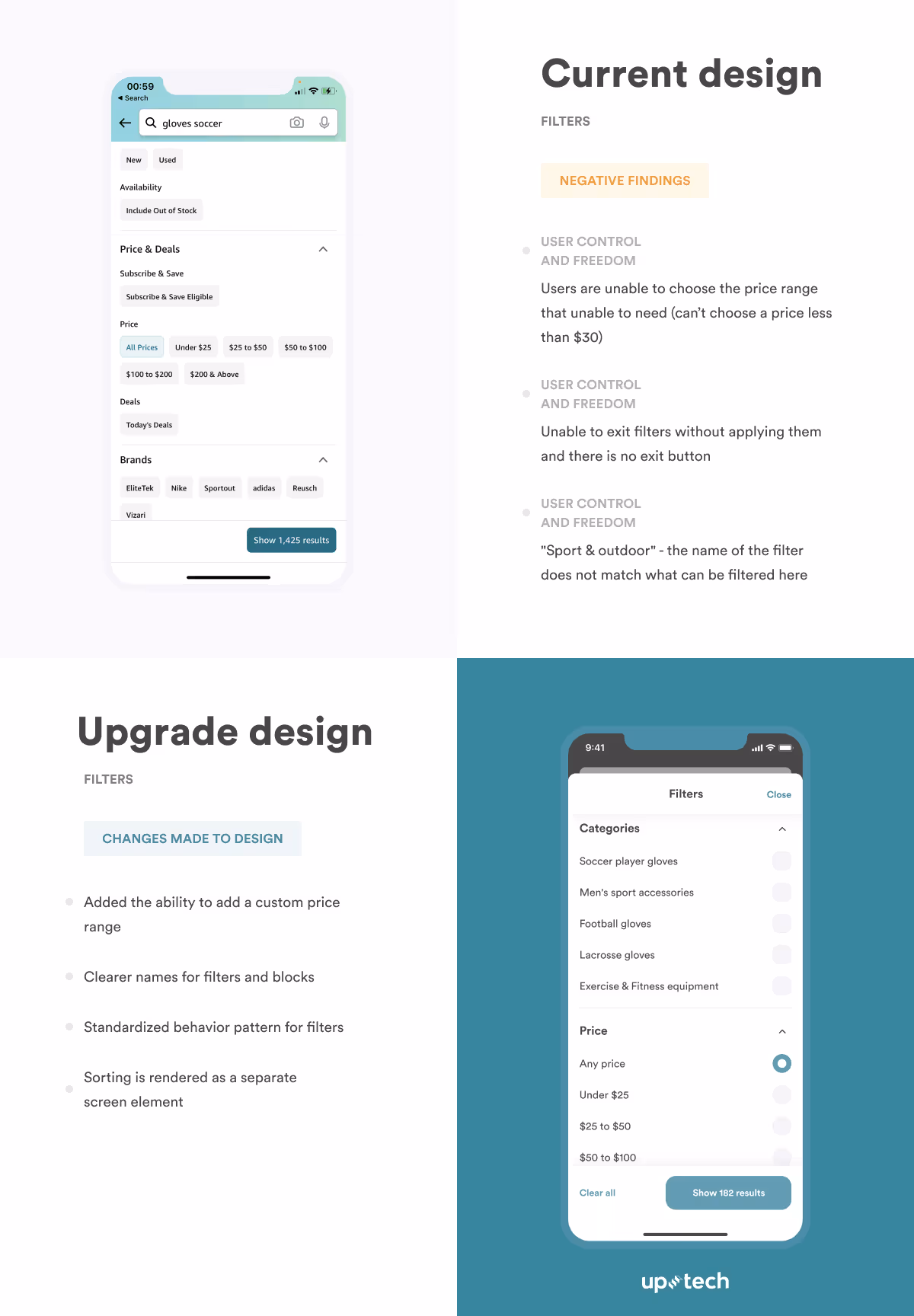
3. User control and freedom
Positive findings:
- Search and results page.
- The user can choose the option that suits him/her from those that the system offers.
- Location selection.
- A prominent message prompts you to change the location if it is not correct.
What needs to be improved:
- Filters.
- Users can't choose the price range that they need (can’t choose a price less than $30).
- Category filter — the user doesn't understand what to choose here.
- "Sport & outdoor" — the name of the filter does not match what can be filtered here.
- Can't get out of filters without applying them, and there’s no exit button.
- Unable to locate ‘filter by size’.
4. Consistency and standards
What needs to be improved:
- Filters.
- Clicking the "back" button brings it back to the previous page without closing the open filter. It should close down the filter on the first click, and return to the previous on the second.
- Strange to see sorting inside filters. This is usually a separate feature for that.
- The "& Up" filter for reviews is inconsistent with the regular practice.
- Select location.
- Despite a predetermined location at the beginning, the states reverted to default when placing an order.
- Product page & Shopping list.
- Inconsistency in displaying information.
- Details, descriptions, and characteristics of the product are already under the recommendations and related products.
- Non-typical usage of a drop-down for choosing the number of units.
- If you click on the "Details" button, a page opens with back navigation, although there is a top-level back button.
- Cart page.
- Quantity selection is implemented differently on the product page.
- The checkout button is above the items in the cart, which is inconsistent with the outside world. Usually, people read from top to bottom.
- The price for products is shown above them.
- Order page.
- Quantity selection is implemented differently than on the product page and the basket.
- Strange order of fields (Country -> name -> street -> city).
.avif)
5. Error prevention
Positive findings:
- Search and results page.
- The system returns the right option despite errors when typing the product name in the search bar.
What needs to be improved:
- Select location.
- No prompt for automatic street selection when filling in the address (for non-US territories).
- Cart page.
- The ‘delete’ button is not highlighted, making it easy to be accidentally clicked on.
- Can’t quickly return a deleted item to the cart.
6. Recognition rather than recall
Positive findings:
- Search and results page.
- The search history is saved.
- Cart page.
- Return possibility message.
- Order page.
- If you exit the screen and return, the fields will remain filled.
What needs to be improved:
- Order page.
- The system detects a Ukrainian user, but shows an American code when entering the default phone number.
- Shows default American fields in the address, although it has detected a Ukrainian user.
- No dropdown list with an autocomplete address field.
7. Flexibility and efficiency of use
Positive findings:
- Search and results page.
- Search with hints after entering a pair of characters.
- Order page.
- There is a checkbox to "make the address default."
What needs to be improved:
- Product page and shopping list.
- Very long scrolling of the product page. It is difficult to navigate and search for the necessary information, to navigate to the characteristics and reviews.
- Order page.
- No social login.
8. Aesthetic and minimalist design
What needs to be improved:
- Search and results page.
- Instead of indicating that the items are not delivered to a specific country, the system should hide those non-deliverable items from the customer's view.
- Product page and shopping list.
- Many different font styles (color, size, thickness).
- Small text is not ideal for people with poor eyesight.
- Cart page.
- Elements look chaotic (different contours, fillets, thickness, size) — little space.
9. Recognition, diagnosis, and recovery from user errors
Positive findings:
- Home page.
- Shows an informational message that allows users to change the address, accompanied by warnings.
- Search results.
User Testing For Pain Points
At this point, we’ve got a list of pain points by evaluating the Amazon shopping app against the selected heuristics. However, they are merely opinions from our team, who are testing the app based on the created proto-personas.
We need to validate that the problems that we’ve encountered are posing real problems for users. Therefore, it’s important to carry out user testing for those pain points.
User testing provides an opportunity to understand the app from a different point of view. It reduces the risk of being blindsided in certain areas during the evaluation.
To carry out user testing, we’ve prepared tasks that are to be assigned to 5 users that we’ve selected. The participants are asked to accomplish the tasks using the Amazon shopping app and record problems that occur.
.avif)
Here are the results that validated our earlier findings:
- Confused with the search results.
- Can’t add to favorites on the search results page.
- Irrelevant recommendations.
- Confused with the purchase screen — need to verify the info multiple times.
- The product page is hard to navigate, has too much info, and is not structured.
- Too many ads.
- Hard to compare items. It takes too long to return to the search screen.
Picking up hypotheses
We’ve identified what’s wrong with the current Amazon shopping app. To complete this UX case study, we’ll need to put together the solutions we perceive to lead to a better user experience.
To do so, we’ve created a list of improvements for all the pain points that we’ve identified and added our thoughts to them. We aim to create a redesign of the app interface and confirm that our hypotheses on the pain points and solutions are correct.
There are, of course, too many pain points to implement in the redesign, and some could be very tedious to do so. To narrow them down, we utilize the impact/effort matrix and select impactful changes that are easy to implement.
Creating a redesign
With the choices of changes decided, we moved on to redesigning the Amazon shopping app in the form of a prototype. We’re sticking with Amazon’s original fonts and colors as they represent the online retailer’s brand identity.
Based on our hypothesis, the new prototype should result in an improved user experience. We created two different versions to gather better insights in testing.
.avif)
Results
Everything we’ve done in this Amazon UX review will lead to nothing if we’re not testing the prototype with real users. We need to be sure that we’ve uncovered the pain points with the existing app and that our recommendations in solving the problems resonate with real users.
Therefore, we decided to turn to a proven method to validate our assumptions — usability testing. Again, we invited a few users with different age groups and professions and got them to accomplish a single task on the prototype. They are asked to buy a soccer glove on the prototype with UX fixes.
As the users execute the task, they are asked to note any problems and thoughts with the prototype. When the app review is completed, we consolidate the results by asking questions like:
- How was the experience?
- What was easy/hard to understand/interact with in this prototype?
- Is there anything difficult to understand at first glance?
- Which version of the prototype do you prefer?
It’s essential to hold the post-testing interview in a one-on-one session. The participants are more likely to be more open with their thoughts when they can talk in comfort. You’ll also have a better opportunity to understand their mindset and behavior when shopping for an item with the prototype.
Ideally, you’ll want to collect as much data as possible during the prototype testing. This is true whether you’re doing a user experience analysis for a 3rd party product or working on your own app.
The data becomes clear guidance for making UX improvements when revising the app. It removes guesswork and assumptions from UX design. As a result, you’ll have a more precise strategy in creating UX that appeals to end-users.
Why Choose Uptech For Your Redesign?
Our team has been on the market for over 10 years. During that time, we’ve delivered 200+ projects worldwide, including end-to-end design as part of our collaboration with:
Nomad — a personalized house hunting platform.
Feeture — a platform for musician collaboration.
Clearly — a mental health marketplace for online therapy.
All of our projects are built on the core principles our team stands by:
- Product-first approach. We start with goals, user behavior, and constraints. Every design decision supports growth, retention, or efficiency.
- Research before visuals. Stakeholder interviews, audits, competitor analysis, and user journeys help us solve the right problem from the start.
- Engineering collaboration. Designers work closely with developers to reduce friction and ensure smooth implementation.
The design we deliver helps our clients engage thousands of users on their platforms, secure millions in funding, and expand into new markets or platforms with confidence.
.avif)
Summary
Amazon could do with a few UX lift-ups in its app, that is, if it intends to appeal to new users. As shown in this UX review, it doesn’t hurt to correct some of the glaring issues with the existing app. Users can get to their desired items with less hassle, leading to increased conversion.
While Amazon could get away with some UX bad practices, budding e-commerce stores will fare differently with the same blunders.
It is vital to carry out usability testing to ensure that users have a smooth experience with the app.